


Business Background
Epic Planner is a cutting-edge wedding planning platform that simplifies and enhances the wedding planning process.
Connects users with a wide range of event vendors and service providers for seamless planning and execution.
Aims to bridge the gap between clients and vendors, ensuring a hassle-free planning experience.
Project Overview
Epic Planner is a wedding planning platform created during a UX/UI bootcamp. This project focused on building an intuitive and user-friendly experience where couples can easily browse, connect with, and book wedding vendors, while vendors can showcase their services and grow their business.
Design a user-friendly website that allows engaged couples to seamlessly browse wedding venues by location, view detailed venue information, and complete the booking process with ease.
Project Tasks
Design Process
Our team of five utilized the Double Diamond framework, based on the Design Thinking methodology, to shape our process. Instead of adhering to a strictly linear approach, we moved through stages iteratively, continuously refining our solutions as the project progressed.
Double Diamond
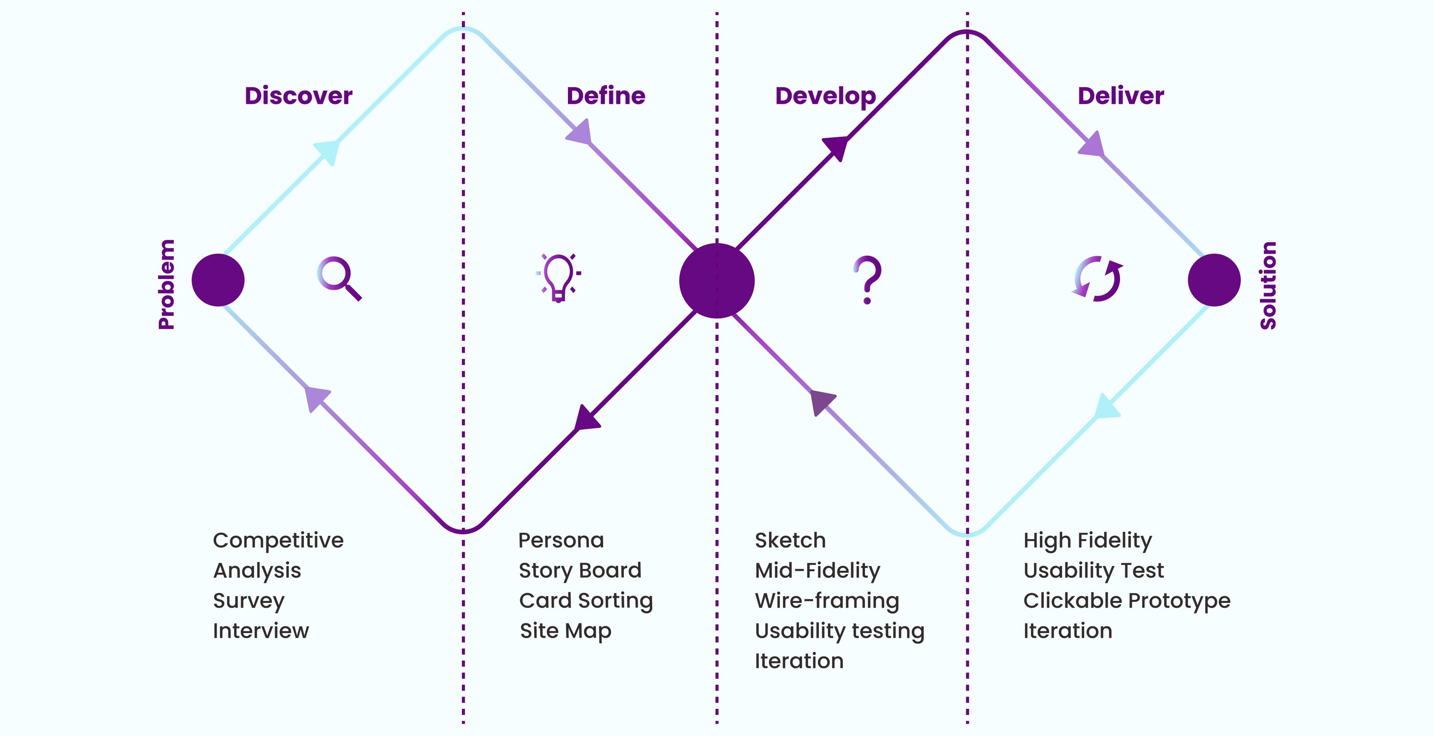
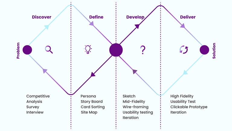
Discover
We conducted our research in two phases:
Phase 1: Interview
Phase 2: Competitive Analysis
Interview
We followed up with five participants to uncover deeper insights into their pain points and challenges.
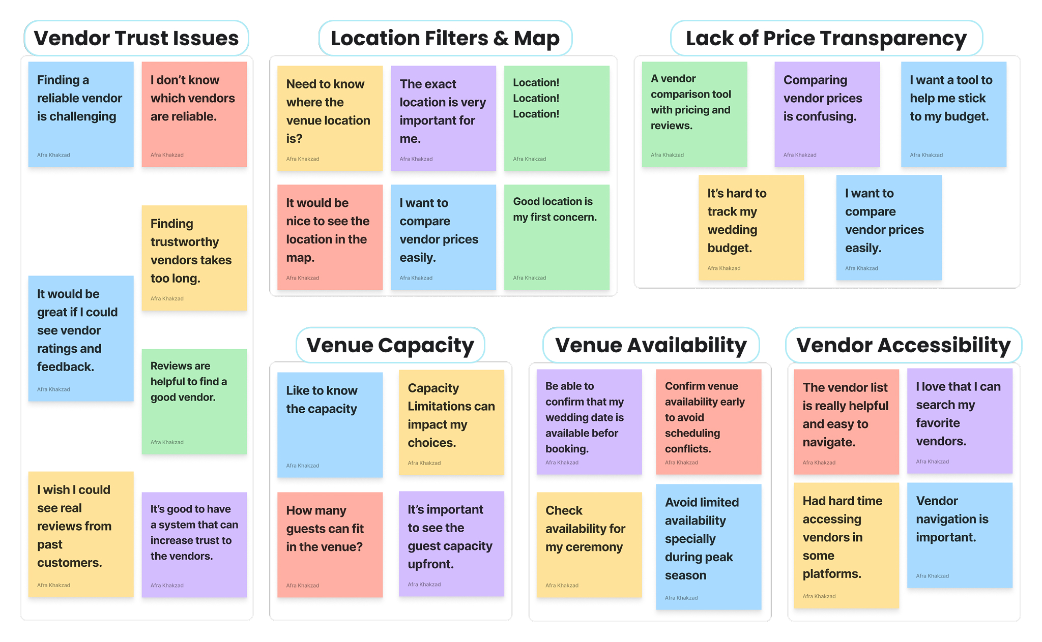
Key Takeaway from Affinity Mapping
The affinity diagram revealed 5 common pain points users face when planning events:
• Users need trust signals like verified profiles, authentic reviews, and transparent business info to feel confident choosing vendors.
• They want clear, upfront pricing to save time and better match options with their budget.
• They need to see venue locations on a map to evaluate convenience and accessibility.
• Users expect visible guest capacity for venues to speed up decision-making.
• They want an availability calendar to avoid the frustration of discovering dates are unavailable after inquiry.
• Users need easier navigation with clear categories and filters to quickly find suitable vendors.
Competitive Analysis
We conducted a competitive analysis of three similar websites, studying their features and user flows. The insights we gathered informed our information architecture and clarified which key features were necessary for our website.
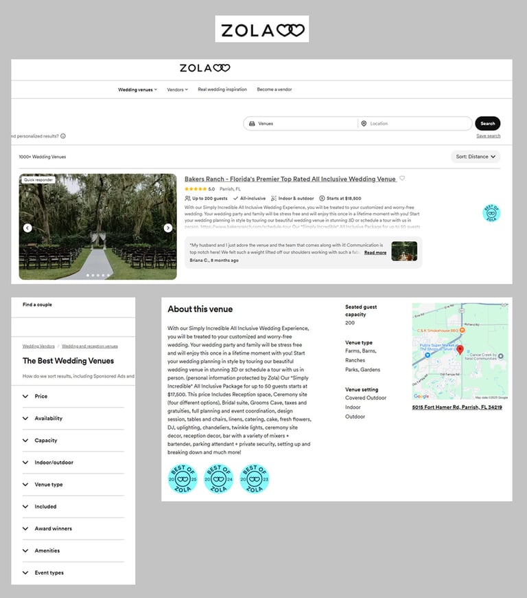
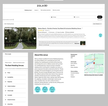
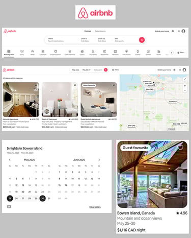
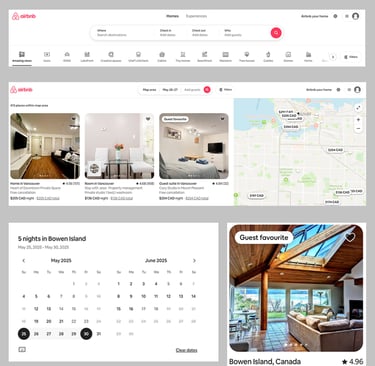
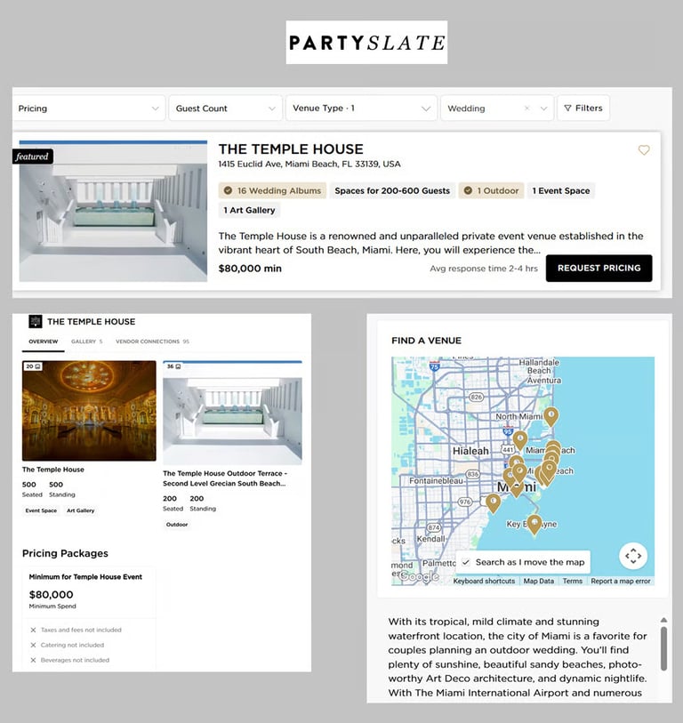
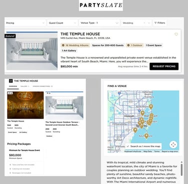
• Advanced Search Functionality: Supports users in narrowing down vendor options by simultaneously filtering based on location and event date, streamlining the search experience.
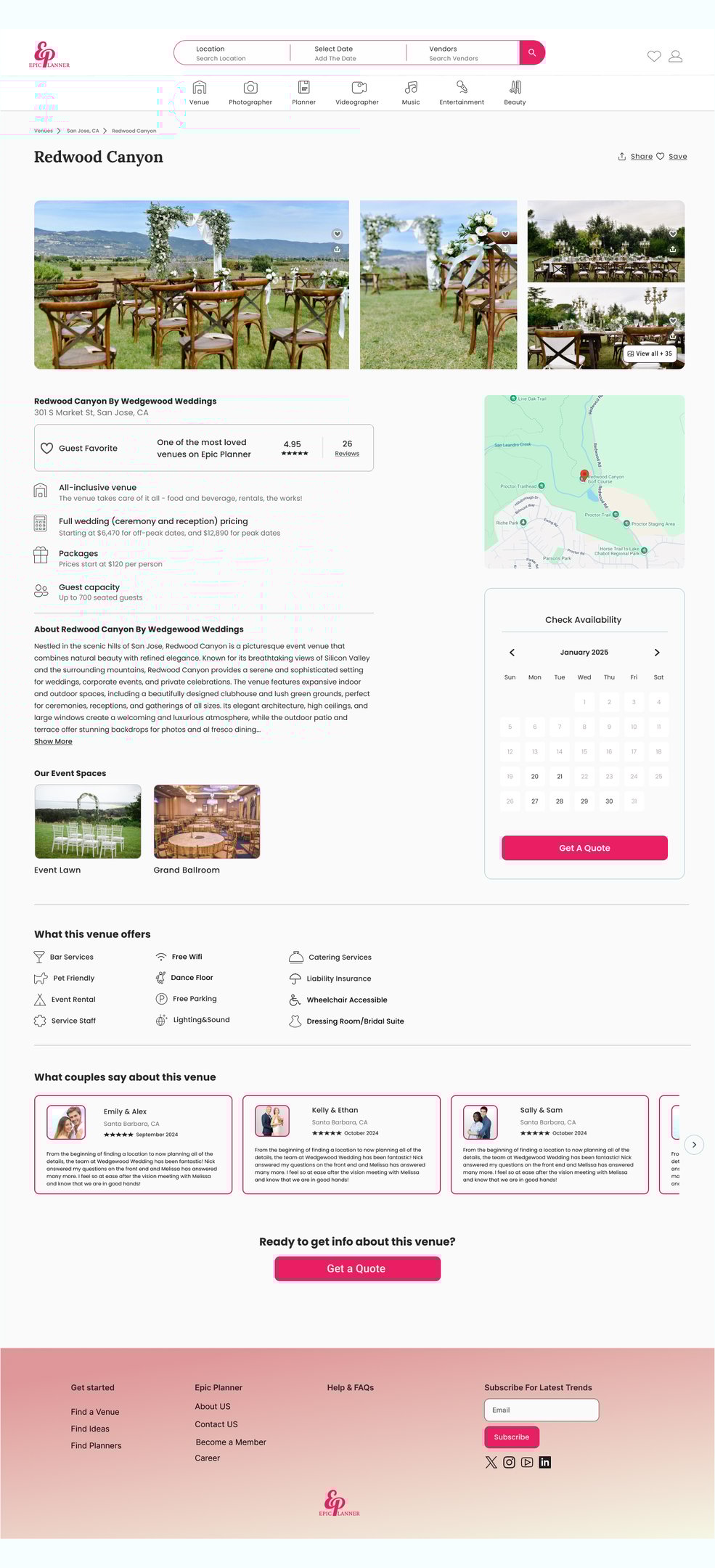
• Real-Time Availability Calendar: Empowers users to instantly view venue availability, reducing friction in the booking process and improving decision-making speed.
• Interactive Map Integration: Allows users to visually explore and compare vendor locations through an interactive map, improving spatial awareness and supporting location-based decision making.
• Transparent Venue Details: Provides users with upfront access to essential details like pricing, guest capacity, and customer ratings, fostering trust and reducing uncertainty in vendor selection.
• Accessible Vendor Search: Organizes vendors into intuitive categories (venues, photographers, music, etc.), helping users easily navigate a wide range of services and minimizing search effort.
Define
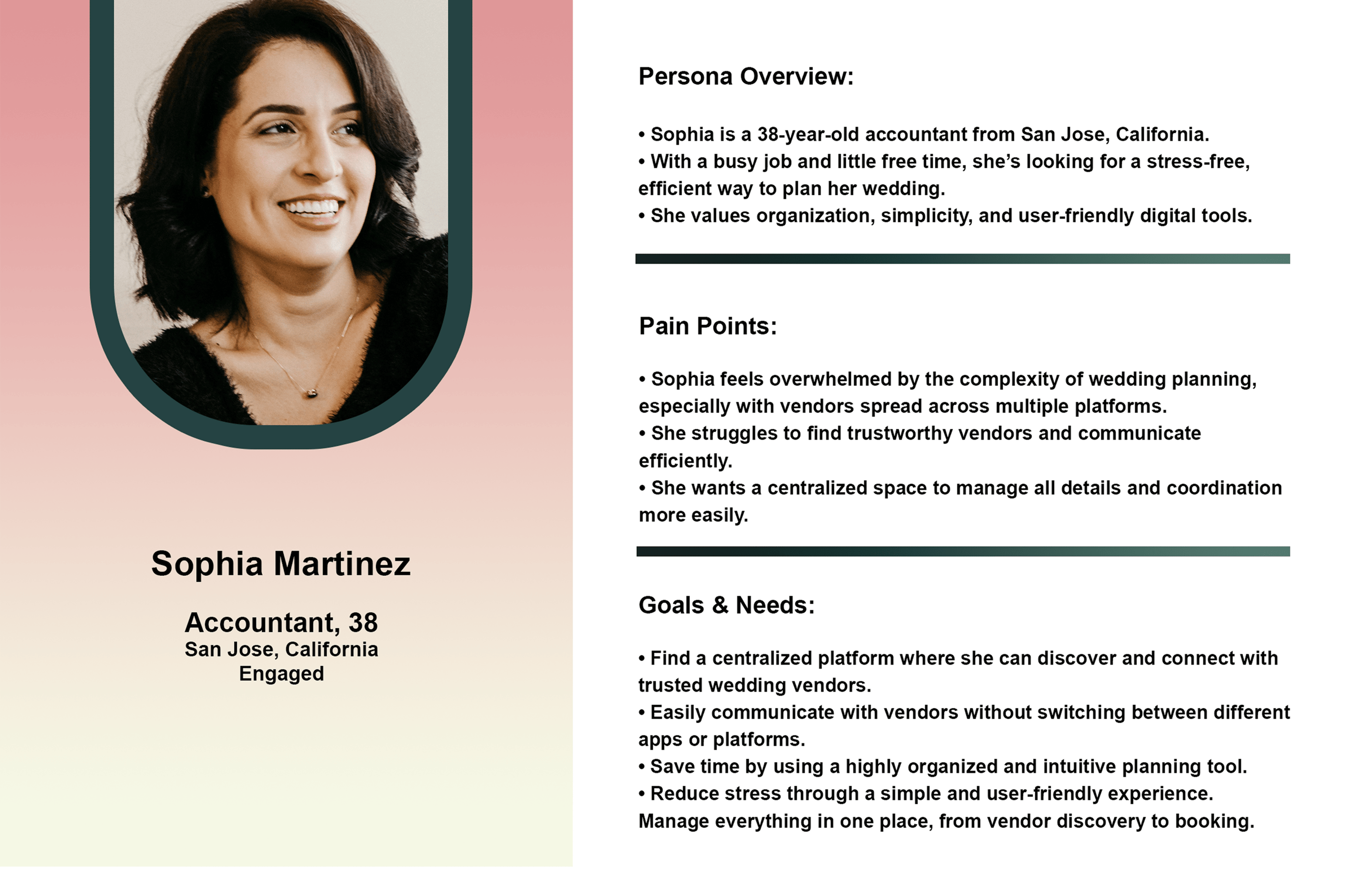
Persona
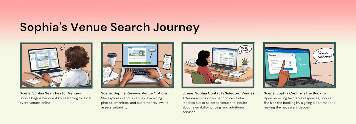
Story Board
This storyboard represents a common user scenario informed by our persona. It allows us to understand their context, challenges, and emotional journey, guiding more empathetic and informed design decisions.
To align the platform’s structure with user expectations, we conducted a card-sorting exercise. This method revealed how users mentally organize information, enabling us to create a more intuitive information architecture. The findings directly influenced updates to navigation, filter categories, and the layout, improving users’ ability to find content efficiently and confidently.
Card Sorting
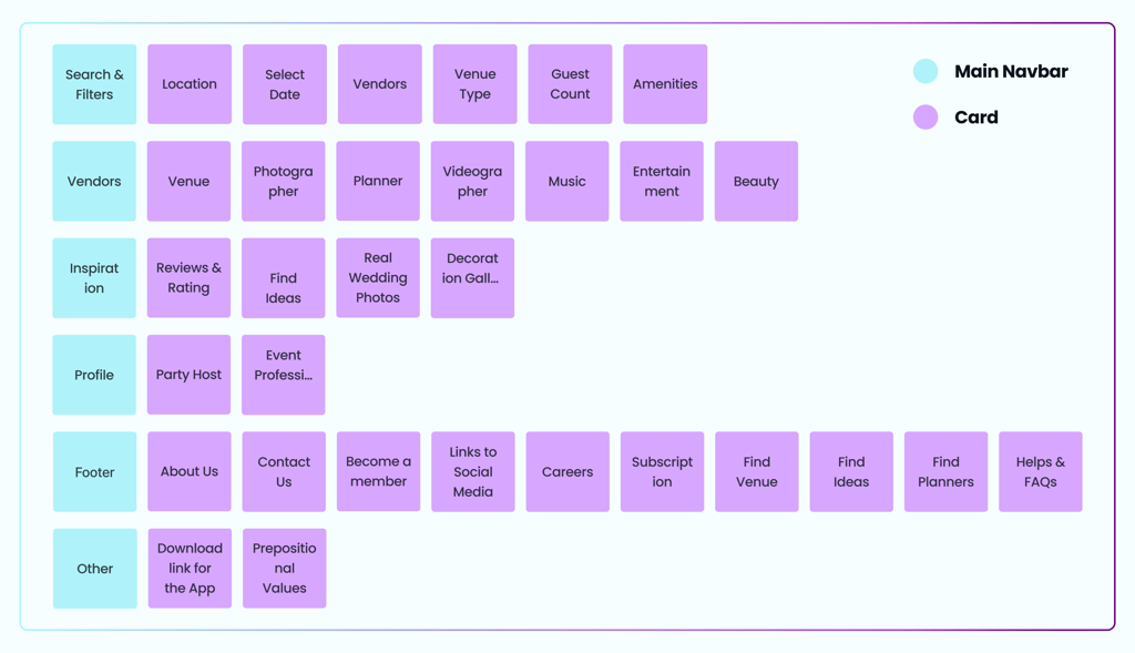
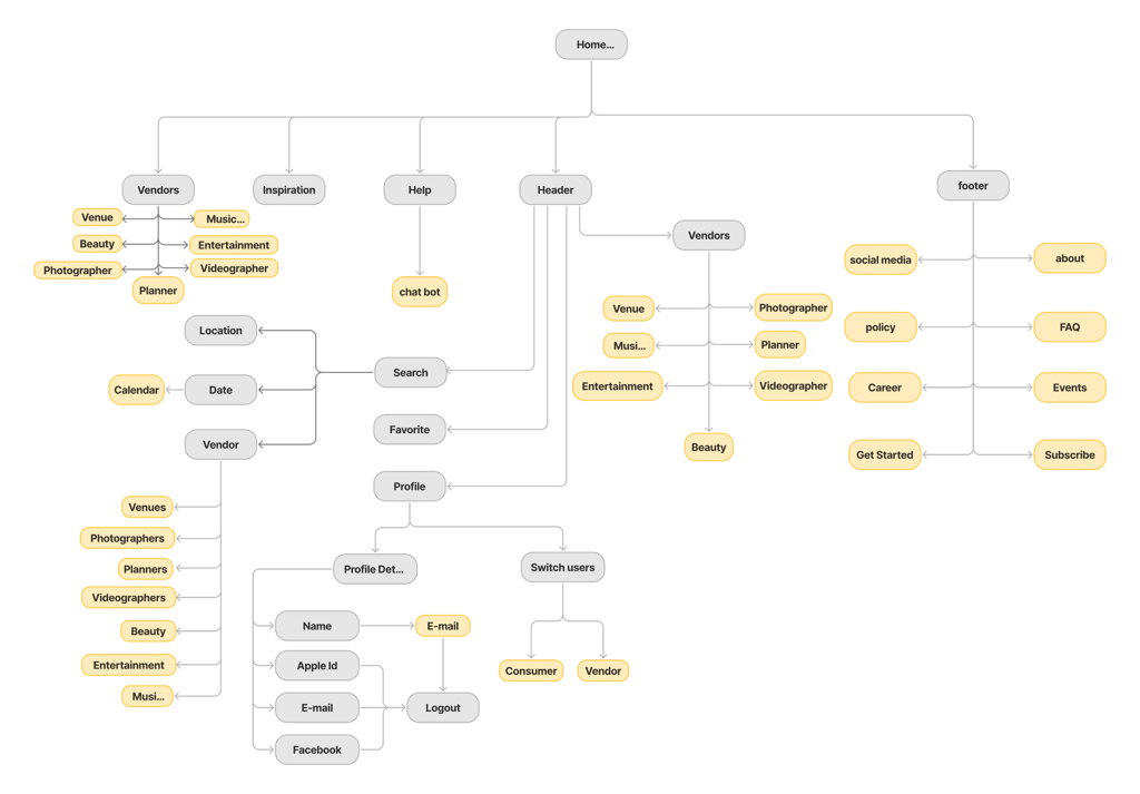
Site Map
Develop
Ideation & Wireframing
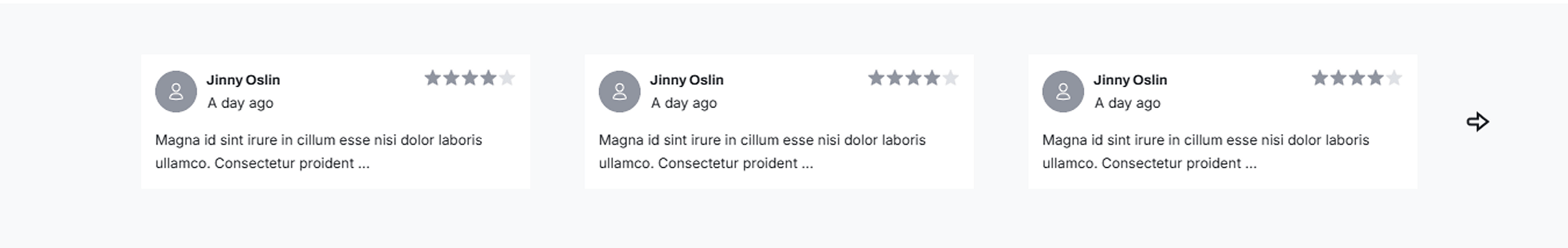
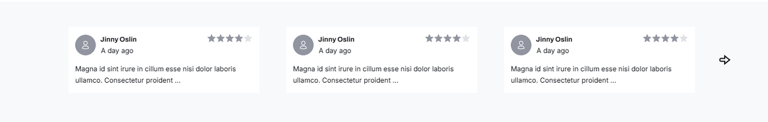
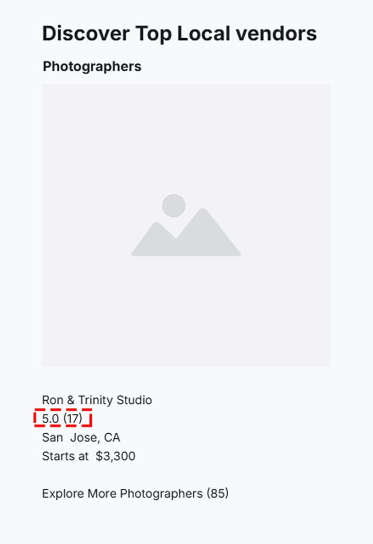
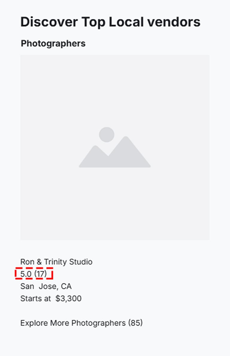
Through iteration, we identified the need for greater user confidence when selecting a vendor. To address this, we added a review and star-rating system to each vendor profile, providing a clear, at-a-glance evaluation of vendor reliability and overall quality.
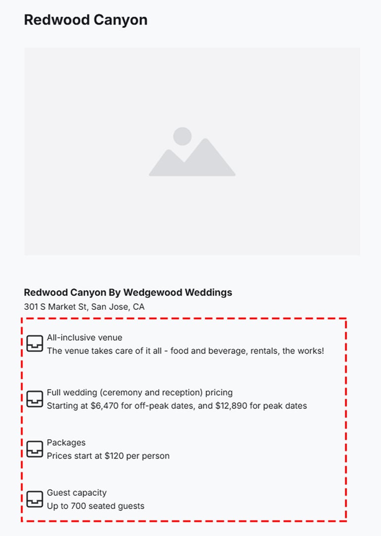
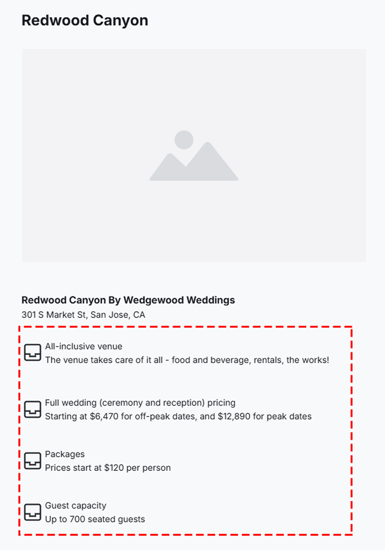
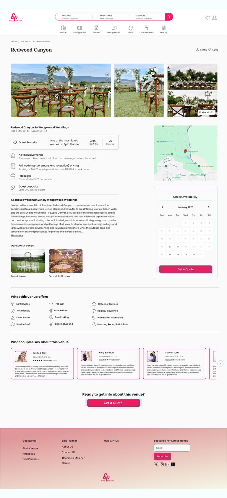
Displayed transparent pricing information on vendor cards and detail pages, including starting prices, package options, and additional fees, helping users make informed decisions with confidence.


Integrated an interactive map view with location-based filters such as distance radius and city/neighborhood, enabling users to quickly find venues near them.
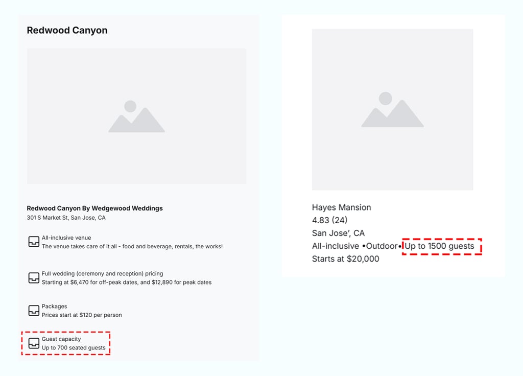
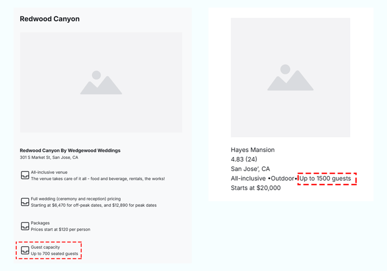
Improved decision-making by surfacing guest capacity information early, displaying capacity ranges directly on listing cards and venue description pages.
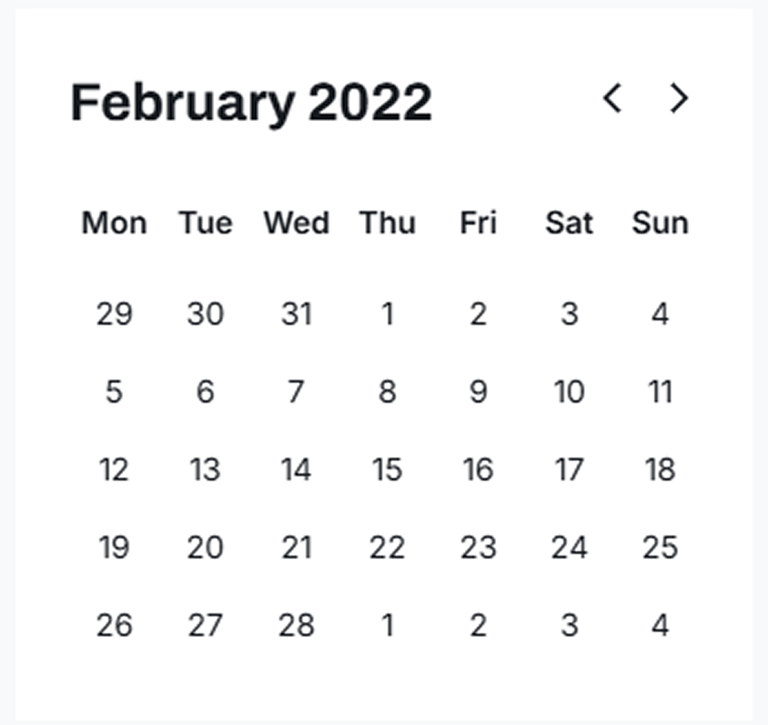
Improved the booking experience by introducing a real-time availability calendar, enabling users to quickly confirm venue availability prior to outreach.
Deliver
Defined the core visual elements for Epic Planner, including the color palette, typography, buttons, and UI components. The UI Kit ensures visual consistency and supports an efficient design-to-development handoff.
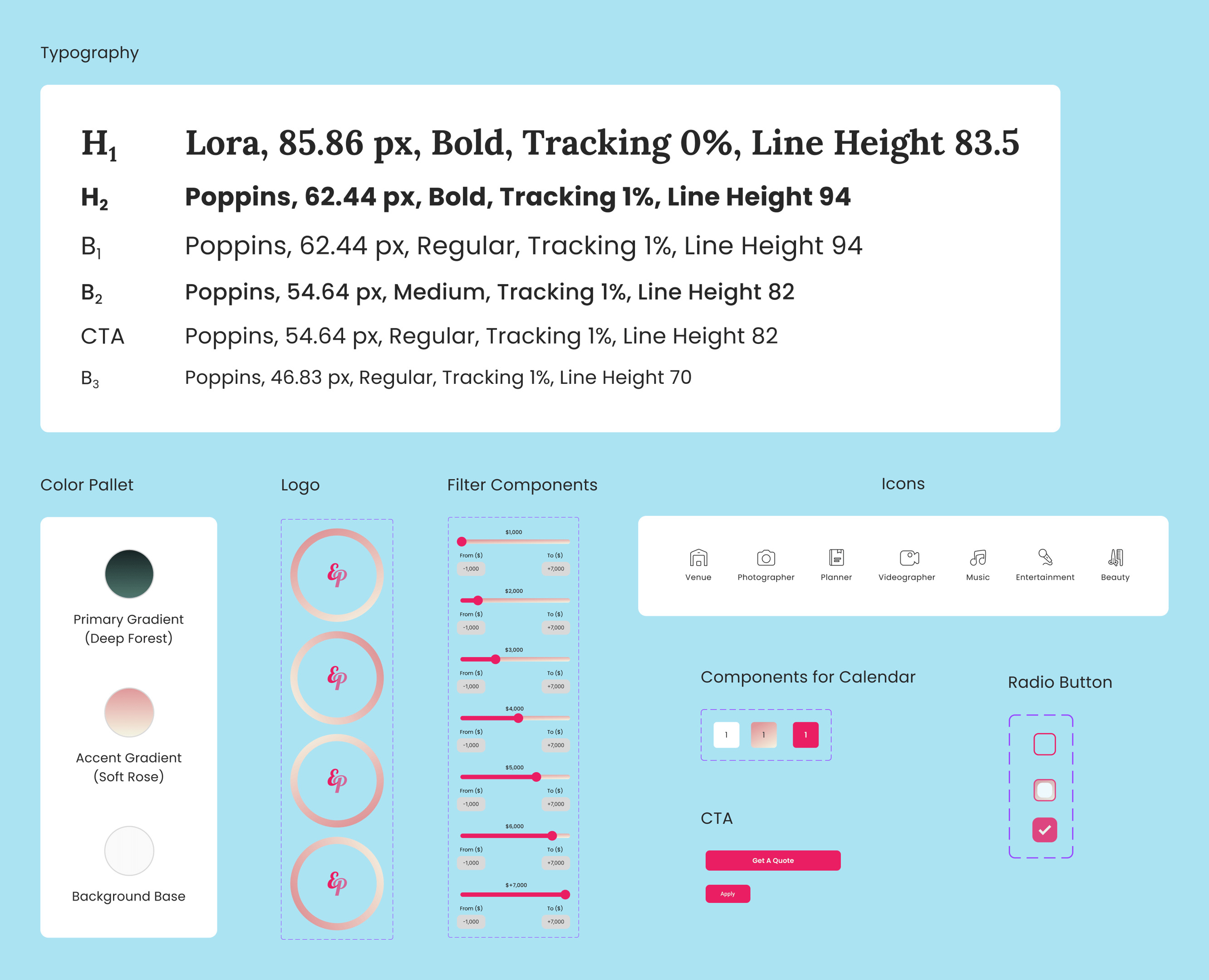

UI Kit
Usability and Iteration
Insights from usability testing led to a refinement of the hero image, aligning it more closely with the website’s core message and improving initial user engagement.
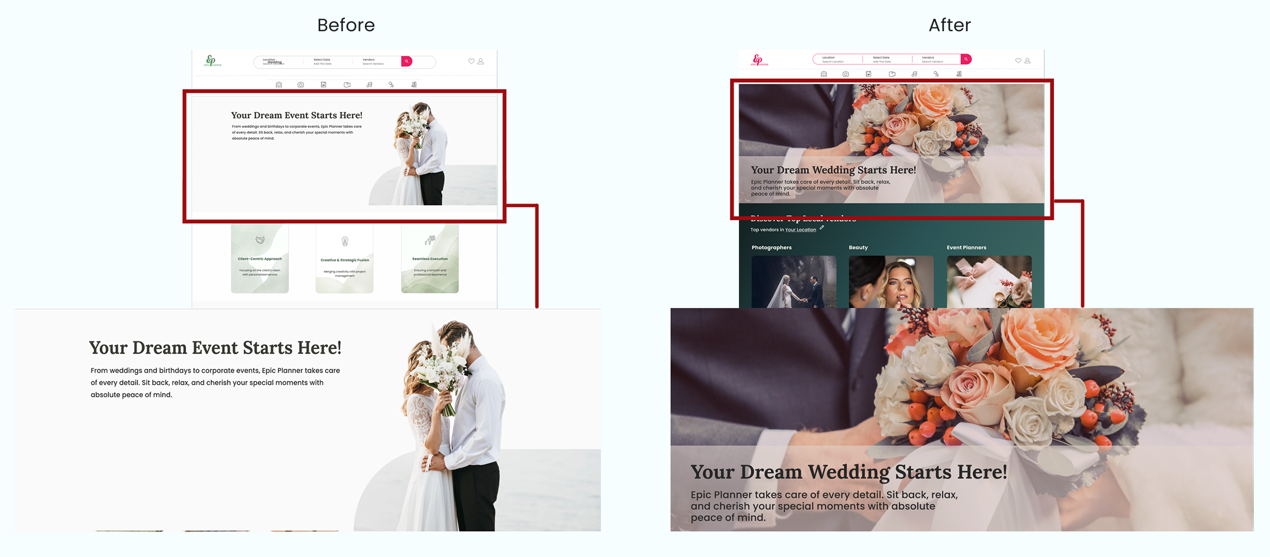
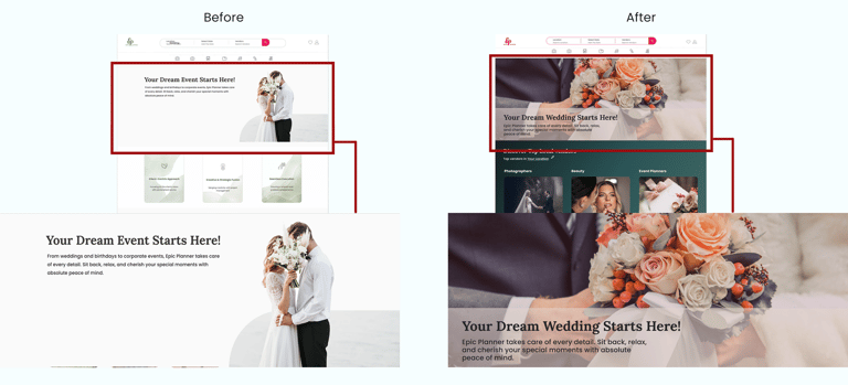
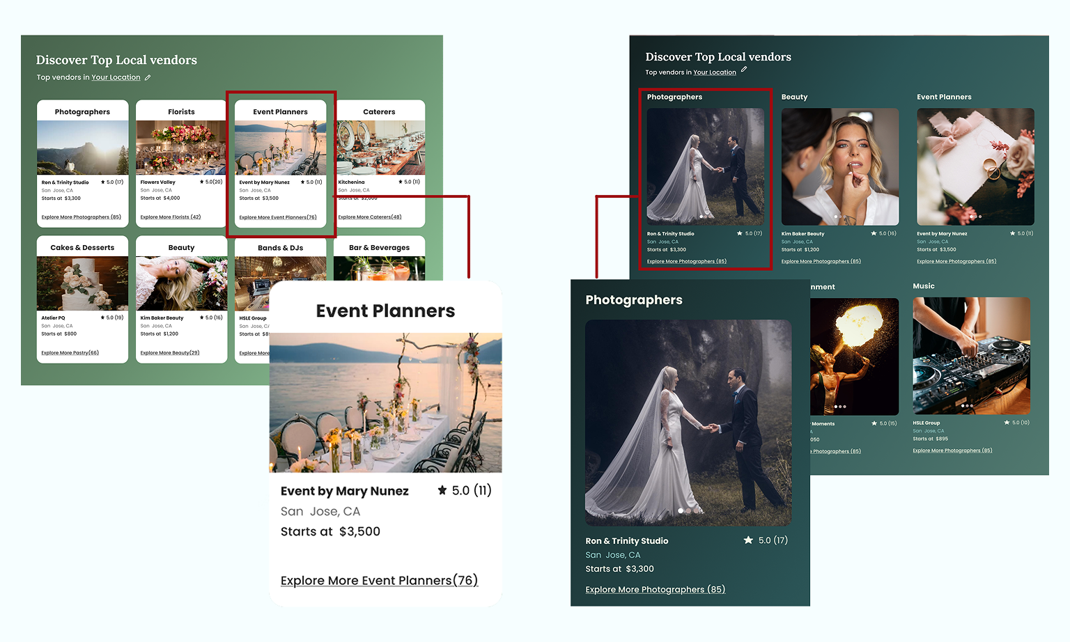
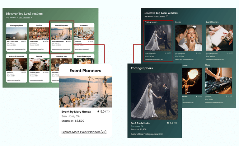
Based on usability testing, qualitative feedback, and visual hierarchy principles, we refined the card layout and color palette to improve readability and support clearer content scanning. Users felt the original colors were too muted and did not convey the joy, excitement, and celebratory atmosphere of a wedding. We introduced brighter, warmer tones to better reflect the emotional context of weddings, enhance visual energy, and create a more engaging first impression.
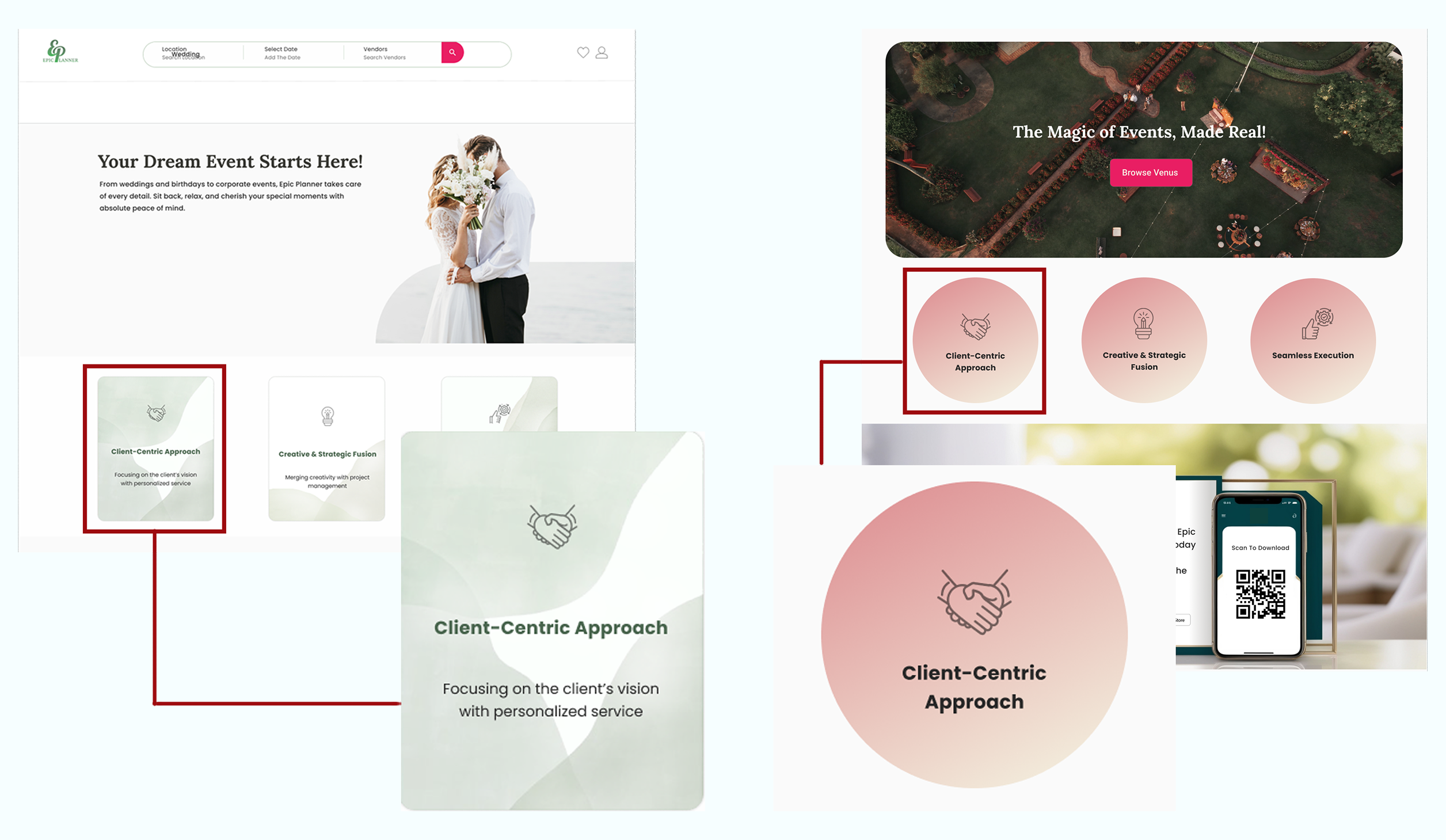
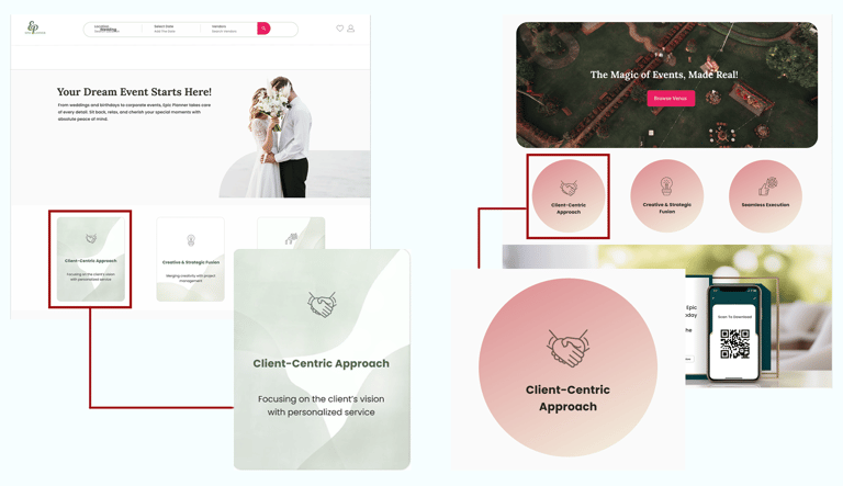
Based on usability feedback, we refined the value proposition section by adjusting its layout, color, and shape. Moving it toward the page’s focal area and improving its visual hierarchy increased noticeability and made the key message easier for users to understand.
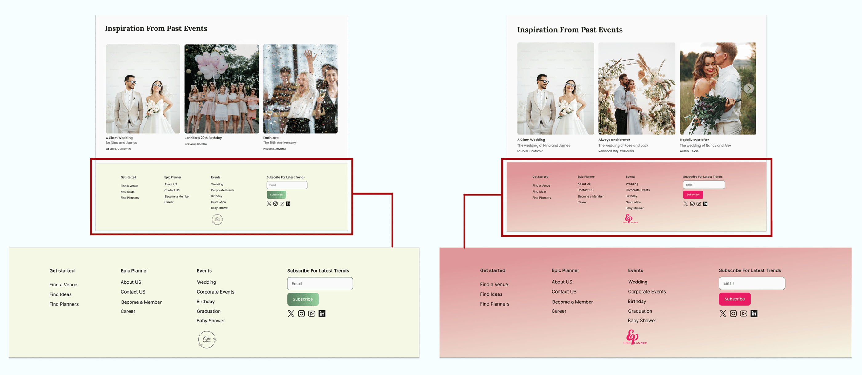
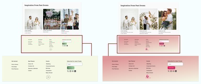
Based on user feedback, we found that the original light green footer lacked sufficient contrast with the rest of the page, making its content difficult to read and visually underwhelming. To improve legibility and create a more engaging visual hierarchy, we updated the footer to light pink, which provides better contrast, draws attention to key links, and enhances the overall aesthetic balance of the page. This change ensures that users can easily scan and interact with footer content, supporting a smoother and more enjoyable browsing experience.
High fidelity Prototype
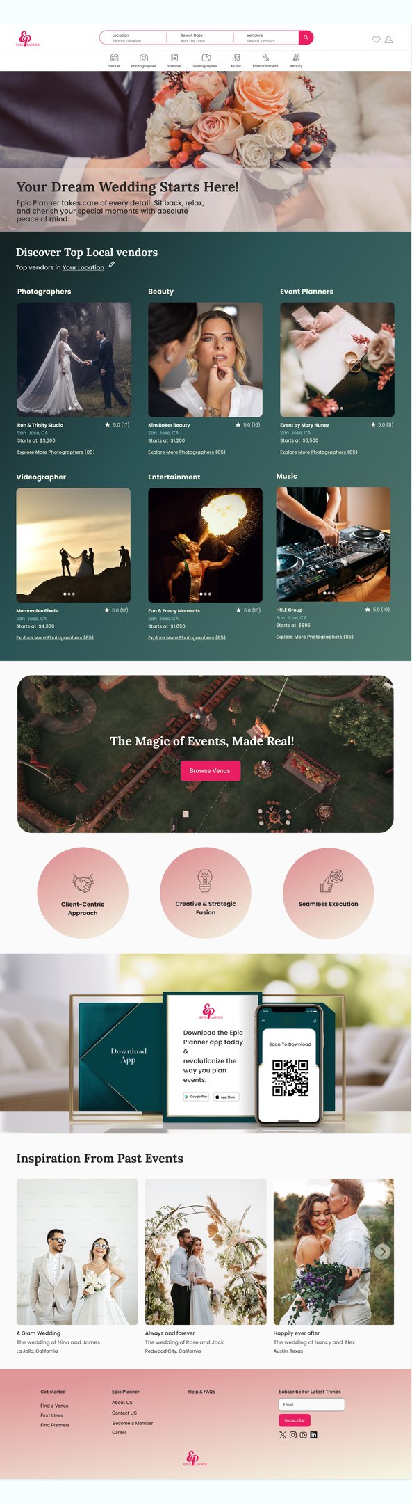
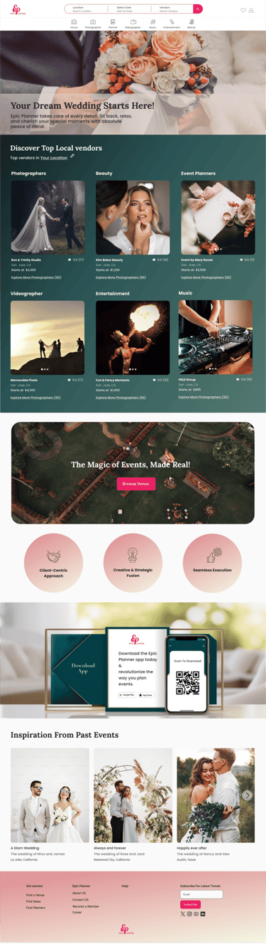
Home page

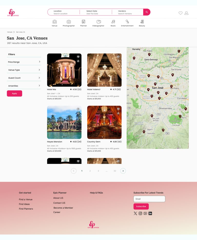
Choose a Location Page
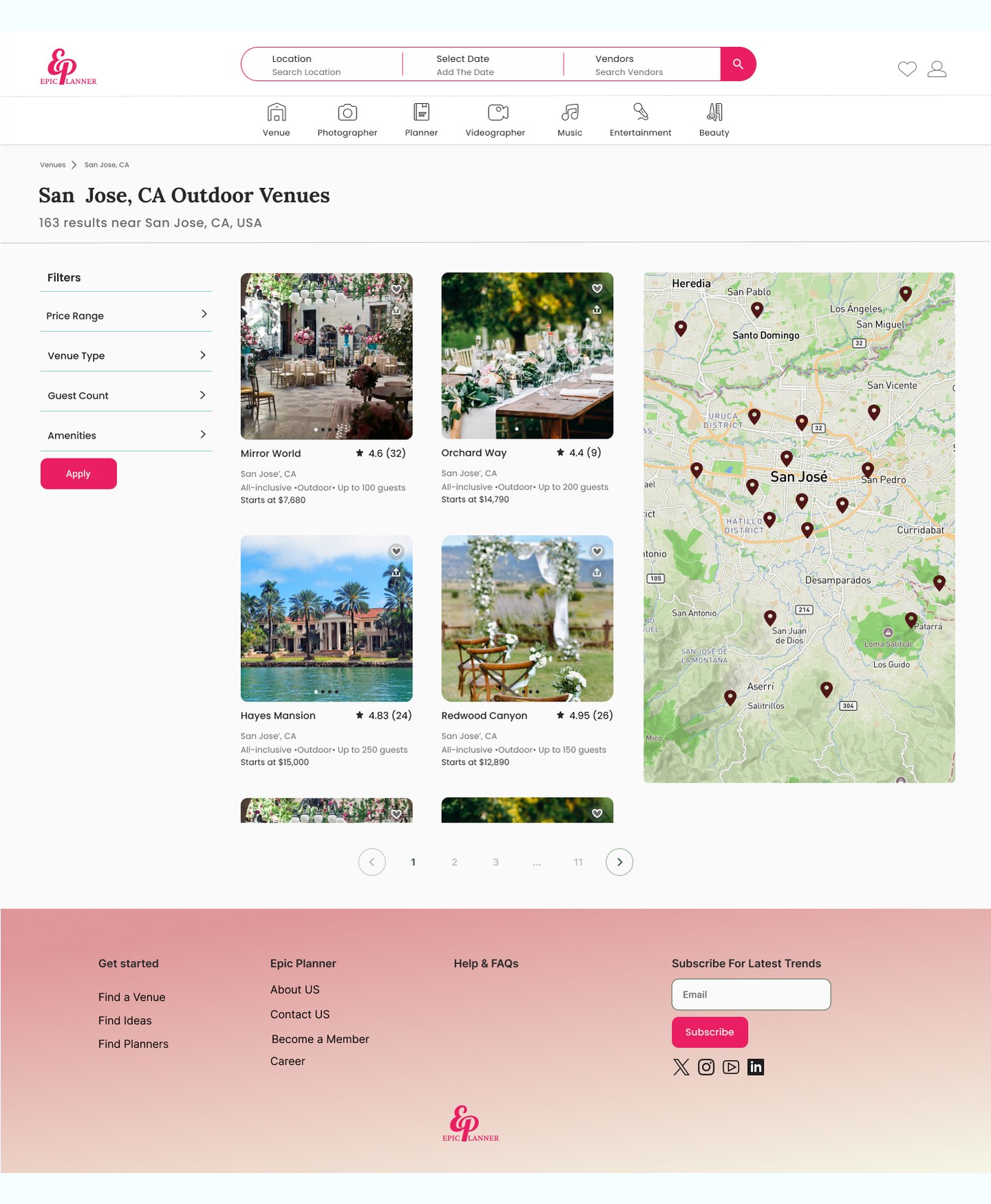
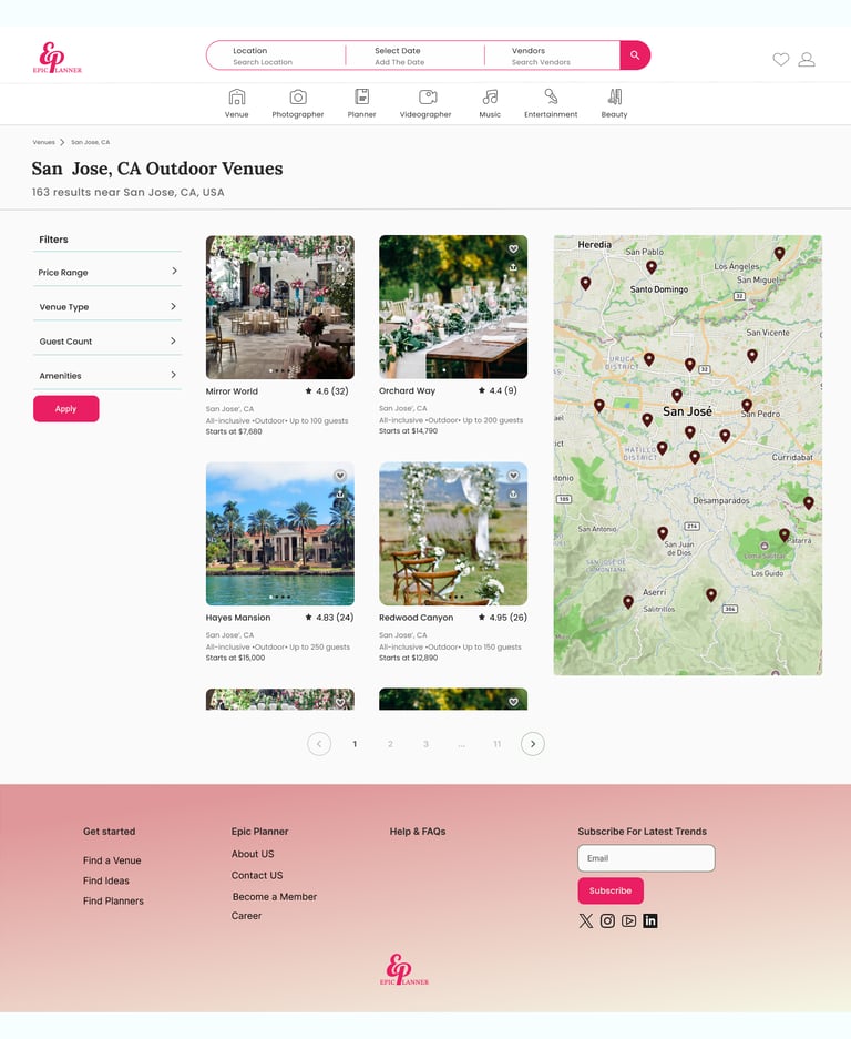
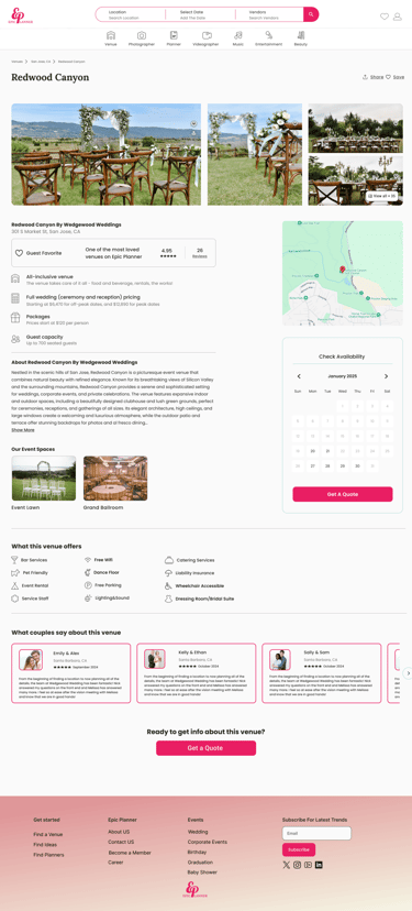
After Filter Page
Get A Quote Page
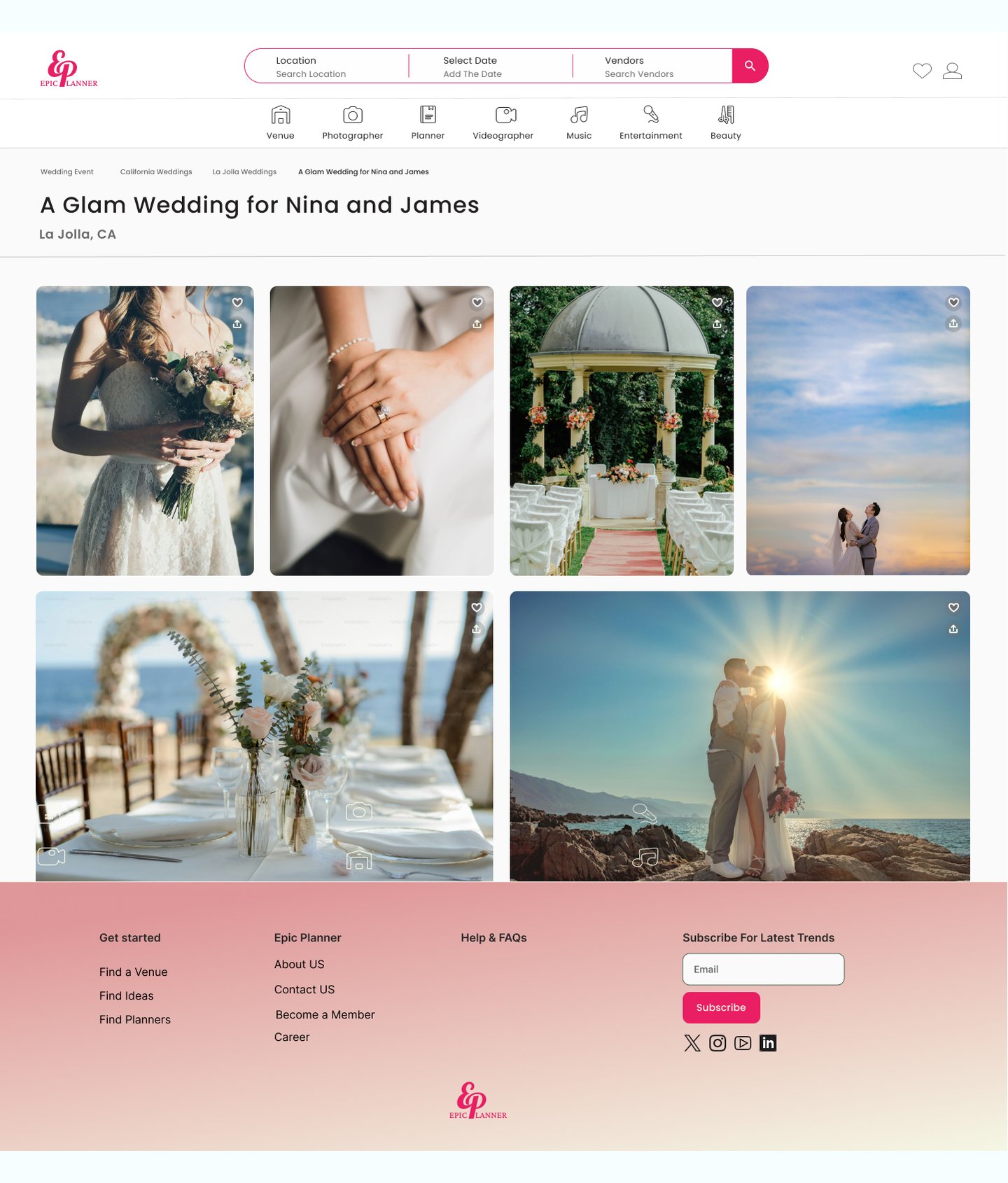
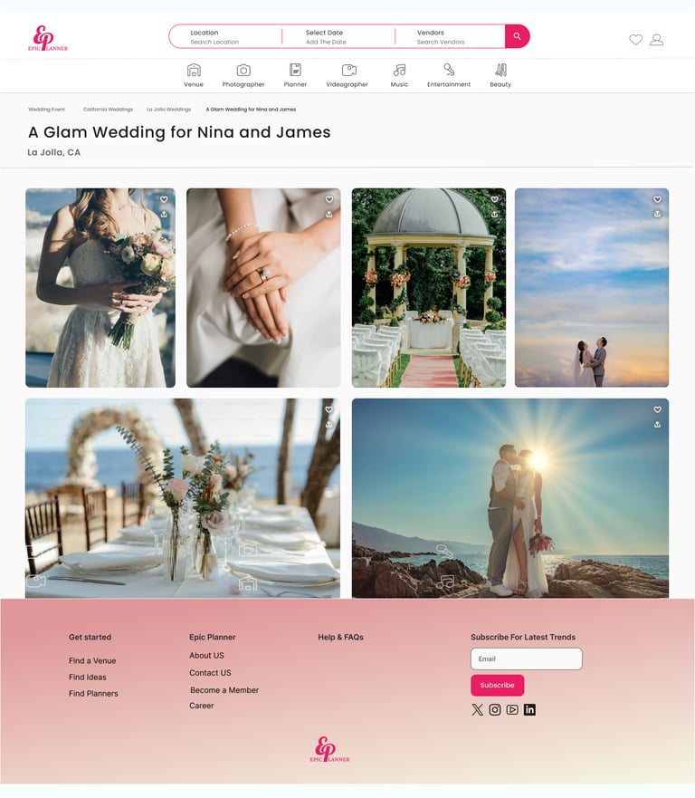
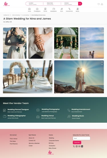
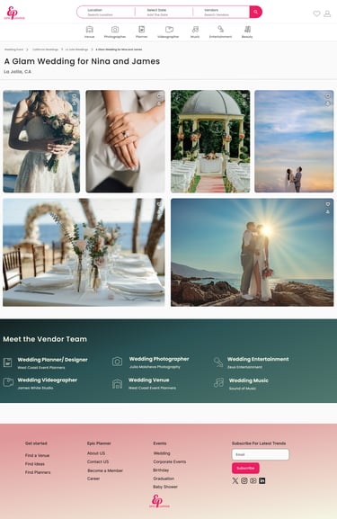
Inspiration Page
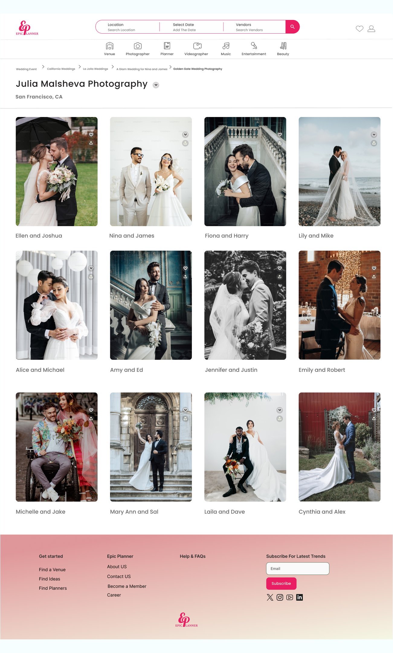

Photographer Page
Through rigorous user testing and iterative design, we arrived at this final high-fidelity version. The following screens map out the complete user flow, alongside supplementary pages designed to provide users with deeper context and information. This evolution ensured that the final interface not only meets aesthetic standards but also directly addresses the pain points identified during the research phase.
Reflection
What did we learn?
We learned how to collaborate efficiently in a team and communicate design ideas clearly.
We discovered the value of usability testing in identifying pain points and improving the user experience.
We gained experience in building a consistent and accessible design system for handoff to developers.
What can we do next?
In the next phase, we can focus on attracting vendors to join the platform by creating profiles and adding their services.
UX can support this goal by designing a smooth and engaging onboarding flow, making it easier for vendors to get started and feel confident using the platform.
This way, we help the business grow while also making sure the experience works well for both sides.